Showing posts with label paint. Show all posts

Friday, July 17, 2015

Painting Interior Paneled Doors to Add Depth and Interest

When we were painting our new-to-us old farmhouse, I knew I wanted to do something a little different with the interior doors. Some of my inspiration actually came from Downton Abbey! I loved how the blend of crisp white and wall color really added a richness to each room.


The living room and dining room are connected, and both are painted Sherwin Williams Misty. I wanted the doors from those rooms to be Misty, too. So each door has white around the outside, and the paneled portion in the middle is Misty.


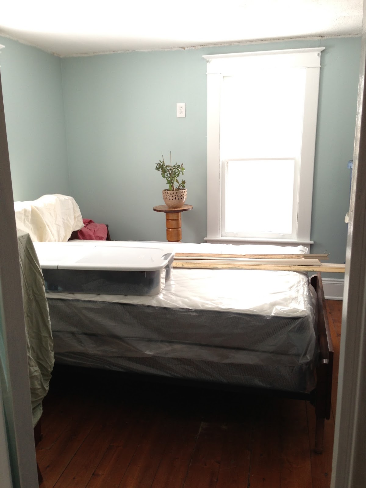
The guest bedroom is Sherwin Williams Sleepy Blue. Again, I used Sleepy Blue in the center of each door with white around the outside. I think it makes this slightly small bedroom look a little bit larger (instead of the two walls being broken up with huge white rectangles) and more luxurious.


Our office is painted Sherwin Williams Rock Candy. The office is far from done, but this little peek shows you what I did with these doors. It's the same as the others with a twist. I thought that the contrast between the Rock Candy and the white was not enough, so I added a darker gray to the angled part of the paneling. I'm not gonna lie... it wasn't easy to get a straight line on these old doors! But it really adds depth and dimension. The color used there is either Sherwin Williams Krypton or Uncertain Gray. Sorry I can't remember which; we painted from a test jar and I didn't label it!


I'm excited to think of some paneling colors for my upstairs doors. That'll be a challenge because of wallpaper in the hallway and the colors of those spaces.

I publish 5 new blog posts each week! Check out the schedule. You can also click on the link below for blog updates.

Best Bet Design Blog

Friday, July 10, 2015

Farmhouse Paint Colors: Sherwin Williams Down Pour in the Pantry

It's the sixth and final week of my #FarmhouseFriday paint colors series! We're not done painting, so there will be more posts to come, but next week there will be a paint-related topic devoted to something other than color. This week, though, we're taking a look at Sherwin Williams Down Pour (SW6516) in the pantry.


Unfortunately, I don't have any before pictures of the pantry. This little room tends to be overlooked because its door blends in with the wall. But now that we have a pantry, I don't want to think about living without it!


The pantry originally had only one shelf about halfway down the wall. We removed a dowel across the top and added two more shelves. The walls were already painted a scuffed blue of a similar shade, so I found a close match and touched them up with this color.


I love how it looks! It may not be Pinterest-worthy but it's functional for my needs. We don't spend a whole lot of time in the pantry but the color is unexpected when you open the door. There's a light in the pantry to help it from being too much like a cave.

I publish 5 new blog posts each week! Check out the schedule. You can also click on the link below for blog updates.

Best Bet Design Blog

Friday, July 3, 2015

Farmhouse Paint Colors: Sherwin Williams Topsail in the Family Room aka the Rustic Room

This is the fifth week of my #FarmhouseFriday paint colors series. The end is in sight... next week will be my last post discussing color! This week I'll talk about the paint color I chose for one of our living rooms, the one we call the rustic room. When you see the fireplace in the photos you'll understand how it got its name!

rustic stone fireplace

When we purchased the house this room was beige with brown wood paneling and built-ins, plus a red, yellow, and green striped carpet. The carpet was first to go. (I'll probably talk more about our flooring choice in a future blog post.) Then we changed the wall color in order to take some of the beige out of the room. There was already a lot of brown going on between the walls and floor.

brown custom built in shelving

I chose a white color with a bluish hue. It's Sherwin Williams Topsail (SW6217). Unlike the other rooms I didn't have much trouble making a decision here. This was the first color I swatched and it was good enough for me. It also went nicely with partially stained board wall in the room. It's a teal color.

SW topsail in a family room

In bright light it appears to be white with a gray base, and at night blue blue tint comes through. It's soothing and a nice contrast to the neutrals in the room. It's also a departure from the gray that runs through most of the rest of the house!

SW topsail in a family room

That's it for this room. I will have some more photos of fireplace and built-ins in future blog posts.

Have a wonderful Fourth of July weekend!!

I publish 5 new blog posts each week! Check out the schedule. You can also click on the link below for blog updates.

Best Bet Design Blog

Friday, June 26, 2015

Farmhouse Paint Colors: Sherwin Williams Quietude in the Master Bedroom

This is week four in my #FarmhouseFriday paint selection series! The time has gone by so fast. It seems like yesterday I was coming up with the idea to blog about paint, let alone it seems like a week ago that we were doing the actual painting!

Choosing a paint color for our master bedroom was difficult to say the least. As a reminder, here's what we were working with before we stripped the wallpaper:


This room is big. It's 17'x17'. So whatever the color it was going to be very visible. 

The room has four windows; two on the South side and two on the West. It doesn't get a whole lot of light because of a big tree.

First we tried gray. We tried about four shades. They looked okay in bright light, but in anything other than that, they looked like concrete. I really didn't want to fall asleep in a master bedroom that looked like cinder blocks!


We tried Sleepy Blue but even that read gray. 

In last minute frustration (we were getting ready to move in so we had to get paint on the walls) I asked for a color sample of something I picked off a random swatch. That color was Quietude by Sherwin Williams. It looked ok on the walls so I just went with it. We used Sherwin Colors on Behr paint from Home Depot.


How do I like it now? It's okay. In bright light it's nice. At night it looks darker and more dull, kind of like an institutional green. So I'm not crazy about that. 


We recently added thermal curtains and it's really hard to find much color selection in reasonably-priced yet high-quality drapes. I went with gray and of course that added to the institutional feel. I'd prefer white, but the ones I've found are either too expensive or too thin.


The master bedroom is far from done. Like I said, it's a huge space, and we're far from filling it. We do want to upgrade to king size bed and maybe use a room divider to put a little workout area in one corner. Once it's a little more finished I will post a furnished photo.

I publish 5 new blog posts each week! Check out the schedule. You can also click on the link below for blog updates.

Best Bet Design Blog

Friday, June 19, 2015

Farmhouse Paint Colors: Sherwin Williams Sleepy Blue in the Guest Bedroom

It's already week three of paint talk on #FarmhouseFriday! This time we're talking about Sherwin Williams Sleepy Blue (SW 6225). I knew I wanted a blue hue for our guest room because it's Anne's favorite color, and she would be the most frequent guest in the room.

Really, anything would be an improvement over the wallpaper and green trim look in the before picture, right?


I actually found a half-used sample can of this color at the Habitat for Humanity ReStore and brought it home to try. The guest room doesn't get a lot of light despite having two windows (they face Northeast). So, the color reads a little darker than the sample on the walls. And that is okay! It's a soothing, unique shade of blue.


This room took quite a bit of work. We had to remove the wallpaper border around the top and replace it with crown molding, repaint all the trim, add a support to the floor to reduce the bounce, and repair the ceiling.


I also had an idea for some cool detail on the doors. That'll be featured in another blog post!

The furniture is my grandparents' first bedroom set from the 1940s. And the 3D wall art on the left is from Japan! I've since added a mirror to the chest of drawers and some additional throw pillows for more color. I'll be sure to share an updated photo of the decor in a future post.

I publish 5 new blog posts each week! Check out the schedule. You can also click on the link below for blog updates.

Best Bet Design Blog

Friday, June 12, 2015

Farmhouse Paint Colors: Sherwin Williams Rock Candy in the Office, Guest Room, and Closet

I'm picking up where I left off on last week's #FarmhouseFriday paint tour. Today's post will be all about Sherwin Williams Rock Candy (SW6231). I liked this one for rooms that didn't get as much natural light.

Darker grays tended to look like cement in these rooms. Rock Candy looked washed out in the rooms that faced South, so I knew it was a good pick for these darker spaces. It was a step lighter than Misty on the swatch, so I knew I liked this tone.

Rock Candy is neat because it looks gray but in some light, it has a purple hue!

For three rooms, the office, a guest room, and our walk-in closet, I didn't know what color I'd like. So I went with a neutral, thinking I wouldn't hate it in a few months and could always change it if I wanted to.

Here are photos of the closet and guest room. None of the office... it's a work in progress!


I publish 5 new blog posts each week! Check out the schedule. You can also click on the link below for blog updates.

Best Bet Design Blog

Friday, June 5, 2015

Farmhouse Paint Colors: Sherwin Williams Misty in the Living Room and Dining Room

The next five editions of #FarmhouseFriday are going to be all about paint. By the time this mini-series is over, I think we'll all be as bored as if we'd watched all of this paint dry! But I know that some people are really, really into paint colors, so I thought this would be fun to share.

After all of the wallpaper trauma (2+ months of scraping!) We were definitely ready to paint. There were four bedrooms to paint, plus two living rooms and a dining room.

One of the hardest parts about choosing paint colors for our house was that the same color could look so different depending on the room, the wall in the room, and even the time of day. It was frustrating to slap on a test color and decide "I hate that" only to love it the next morning in different light.


We knew that we wanted the paint to be fairly neutral, but we didn't want white or beige. Gray tones seemed like a good fit, especially once all of the trim was a crisp, new white.

Lots of trial and error went into choosing these colors. We bought numerous paint samples. Some looked like concrete, others were too dark, others were too light.


The first paint color I fell in love with was Sherwin Williams Misty (SW6232). (All of our colors are by Sherwin Williams, but the paint is all Behr.)

From the first swatch on the wall I really liked this color. Early on in the process I learned to search Pinterest for my current color of choice. How did it look in different rooms? I didn't find a bad photo of Misty.

Misty wound up in our formal living room and our dining room. These two rooms are connected in a fairly open floor plan, so the colors had to go together well. I thought of choosing a slightly darker hue for the living room because it lies beyond the dining room. We wound up painting them the same color, and it is does read a little darker in the living room because there's not quite as much light there in the afternoon.


I publish 5 new blog posts each week! Check out the schedule. You can also click on the link below for blog updates.

Best Bet Design Blog